
NRMA app
redesign
This case study touches on the restructure of the app, brand alignment and designing for accessibility.
Company: NRMA insurance (IAG)
Project Name: Mobile app redesign
Roles and Duration:
Mobile app designer
Interaction & visual design, Prototyping & testing, User research
Sept 2018 - May 2019
In collaboration with Shiwah Tse
About NRMA
NRMA is a premium insurance brand that has a customer base of 3 million people.
They offer a range of products from car, motorcycle and home insurance, to travel insurance. The mobile app allows users to check,edit and make a claim to their
insurance policies.
NRMA is a part of Insurance Australia Group Limited (IAG) which is the largest general insurance company in Australia and New Zealand. The Group’s businesses underwrite almost $12 billion of premium per annum, selling insurance under many leading brands across the Asia-pacifc.
The Problem
Business problem:
-
NRMA could not share mobile components for use in other new mobile app projects and for other insurance brands within IAG
-
Business did not have the budget and resources to manage multiple apps within the company
-
The app is not scalable for future app functionality
Customer problem:
-
Inconsistencies in user patterns and components resulted in poorer user experience
-
Users have trouble navigating, finding and editing content within the app
-
The app is inconsistent with the brand positioning and values within the market which raises security concerns
-
The app is in-accessible to users who have physical disabilities and/or vision impairments
The Solution
1. Mobile app design library
A component library is to be developed that allows it to be repurposed for other new NRMA app projects. The whole NRMA app user experience and design, will be replicated for other insurance brands under the one code and managed by the one product team. This is detailed in another section.
2. IA and restructure
Navigation of the mobile app will need to be reconsidered based on the research findings.
Challenges
-
Getting everyone on board
This proved to be a challenge as not all stakeholders may see the value of a design system an developers would much prefer to work on the next exciting technology. But in order for a project to have the best outcome, everyone needs to be cheering for the same team.
-
New branding
NRMA was undergoing a new branding strategy and deliverables were spread out across the financial year which meant we had limited guidance on brand direction and assets. Furthermore, reaching out to other insurance brands required knowing the right stakeholders.
-
Consistency across the web platform
It was necessary to work closely with the brand and the principal design team, that were across multiple projects to ensure consistency on all channels. While this was important, the needs of a mobile user were different to those of desktop user. We had to ensure mobile had its own voice, as it had its own native components depending on the platform.

User Research
We were a product team made up of UX/UI, product owner and developers. The whole team were involved from developing the hypothesis, detailing assumptions, attending ideation workshops and helping with user testing.
User research was conducted over a period of 3-5 months and focused on:
-
New structure and Navigation
-
Findability of content
-
Comprehension of content
-
Desirability for multi-payments
-
Alignment with brand
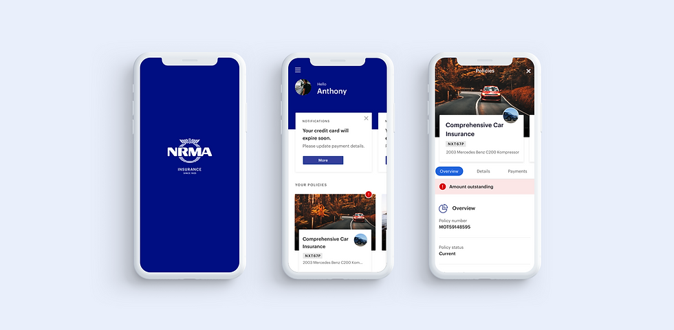
New structure
and navigation
Key insight: We realised that a majority of the findability and comprehension pain points had to do with the IA & structure. Users were navigating between the menu, bottom nav and cards on the dashboard. In the new design:
-
5/6 used the home screen as the main navigation point
-
4/6 swiped the header to access different policies in the policy section
-
6/6 used the hamburger menu to find settings or contact information

“This is great, it’s easy to get to. Before I had to call NRMA to find information about this.”
Nilanga, 50-59 yrs old
“Good layout as it’s broken down into section. I would prefer using this app”
Christina, 40-49 yrs old
“Not necessary to have claims in burger menu but I’m hardwired to go burger menu for anything I
can’t see”
Mary, 30-39 yrs old
I prefer the new app cause the home page is a great compass point. You can navigate the screens so much better”
Keith, 50 yrs old
Brand alignment
Brand alignment was important as the app was inconsistent with NRMA brand positioning and values within the market.
We played with various design concepts in the beginning but as the brief morphed and changed over time, the initial design concept was no longer meeting the brief requirements. Using large visual imagery limited the flexibility of the design to include various content. It would increase the workload for designers and developers if the app was to ‘switch’ to another insurance brand.

NRMA Brand values
We briefly investigated how users relate to the brand and how they identified with it through a series of images. This was an important part of the product strategy and at the time hadn't been consolidated by the brand team. It also guided us into selecting appropriate imagery that resonated with the mobile app audience.

“Koala is generic and confusing. Does not relate to NRMA. Kinda manipulative on the feelings.”
Vel, 35 yrs old

“I’m not a heart-warming person,
I just like that it’s clean”
Bryan, 30-39 yrs old

“I prefer it to be clean with no big advertising images so I can find things easier.”
Rebecca, 40-49 yrs old
 Brand personalityIconic - Customers often see NRMA as iconic due to its long standing reputation |
|---|
 Brand images testedThe Koala image came from a campaign and user tests revealed it did not resonate with customers. They associated NRMA with more the image on the right. |
Designing for Accessibility
Research was undertaken by the team to better understand and empathize with users who had trouble accessing the NRMA mobile app due to physical disabilities and visual impairment. This research compromised of:
1. First and foremost, understanding and
empathizing with our user group
2. Tech spike to determine the availability and feasibility to integrate existing technology
3. Understanding Accessibility standards set out by
WCAG 2.1 for mobile applications
We didn’t really complete it in this order but we should have, as meeting with the user group first would have convinced everyone to jump onboard the accessibility boat when there were many differing opinions regarding effort vs business requirements.


User group
Our product team were fortunate enough to speak to this user group, as they share some of their experiences with technology and how it affects their lives on a daily basis.
We were able to observe a user with mobility problems that requires a wheelchair, using a joystick attached to her forehead to input text into a keyboard and navigate the web.
One particular 70 yrs old key speaker who suffered from blindness, recounted the difficulties studying at university when he was asked to flip through a book to a specific page. He proclaimed that the invention of ebooks had truly changed his life as it allowed him to navigate pages easily with the use of audio recognition and screen reader.
But what was even more enlightening was to understand their frustrations on how simple design tweaks on our end can transform their experience and make their lives easier. To state the obvious, this created empathy and inspired the team to advocate better practices within the business.
Tech spike
The devs had a tech spike to learn how they could implement some accessibility features and from there we discovered that:
-
Andorid and IOS had its own way of magnifying text. Pinch and zoom wasn’t a standard but possible to use an external code library. Most apps didn’t have pinch and zoom besides google maps.
-
Text on both operating systems can be turned on for accessibility. Both can set a max text size to prevent actions being out of context and not making sense. Android handles the max text size slightly differently.
-
Screen readers (Voiceover in IOS) was inbuilt into the phone and only needed to be ‘turned on’ to allow for accessibility
-
Switch control for IOS allowed for users with limited mobility to have full use of their devices with the help of ability switches and other adaptive devices.
-
Customise gestures for both operating systems can be set and altered according to user needs. Gestures like rotate and shake are available even when your iPhone is mounted on a wheelchair.
There are many more...

Learnings
1. Working with people
You can educate people about the why's and how's but it is up to them to change. It is very important to speak up when it is necessary and it's ok not everyone will be onboard.
2. Designs and research
We are constantly changing the product and the file structures, perfection does not work hand in hand all the time with this.
3. Working with my lead UX was fun and I appreciate the different methods of capturing and documenting user satisfaction.